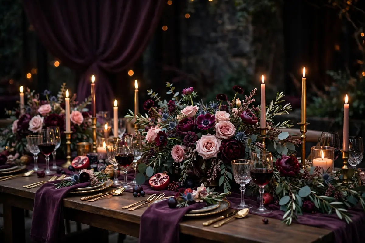
Plum is the color of the season. Pinterest searches for plum and olive weddings are up 1,380 percent, and the palette photographs like a painting. Deep, romantic, and a little moody, plum works from fall through winter and suits candlelit rooms better than any pastel.
The trick with plum is balance. Pair the dark tones with soft blush, dusty rose, or olive green so the look stays rich without turning heavy. Here are 11 ideas that use plum in every part of the day.
Mismatched Plum Bridesmaid Dresses
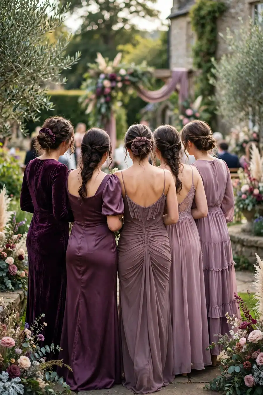
Dresses in a gradient of plum tones: deep plum, merlot, fig, and dusty mauve, each bridesmaid in a slightly different shade. The tonal mix looks expensive and photographs with real depth. Give the group a fabric swatch card with four approved shades so no one drifts into bright purple. Styling tip: keep the dress silhouettes similar (all long, all simple). When the colors vary, matching shapes keep the group looking unified.
Merlot Taper Candles
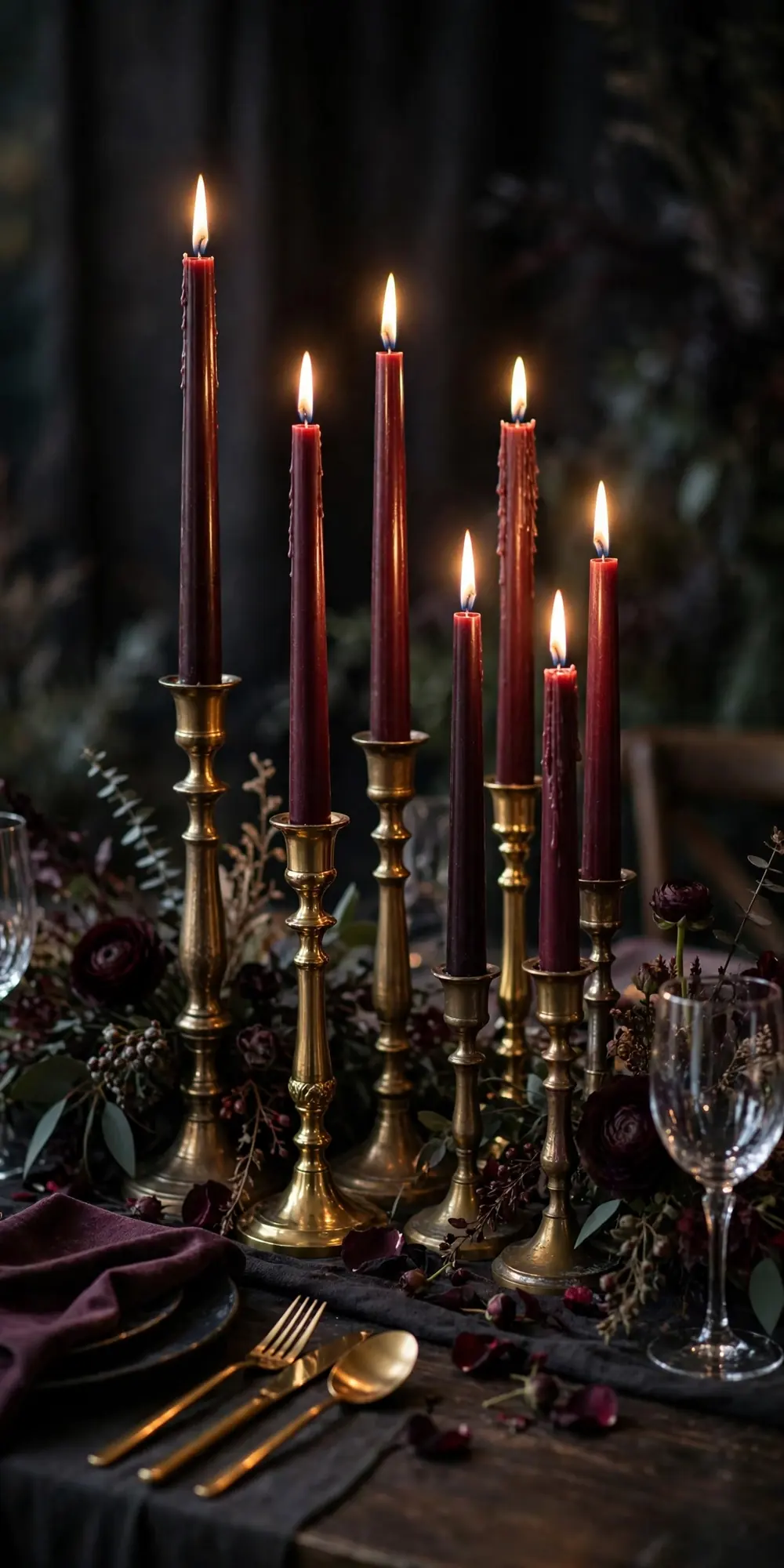
Tall taper candles in merlot and oxblood down the center of every reception table, in brass or gold holders of mixed heights. The candlelight against the dark wax is the whole decoration. You barely need flowers. Buy dripless tapers. Regular ones drip wax onto your linens within an hour. Styling tip: cluster the tapers in odd numbers (three or five per cluster). Even numbers look lined up and formal, odd numbers look styled.
Fig and Grape Tablescape
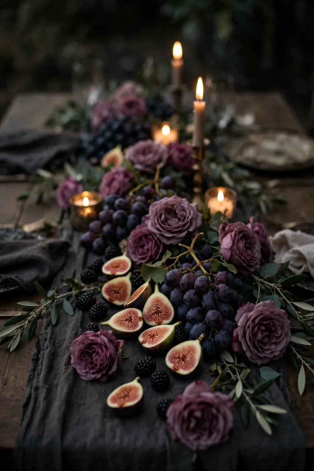
Low centerpieces built from fresh figs (halved to show the pink centers), dark grapes still on the vine, blackberries, and a few garden roses in plum tones. The fruit is the decor, and guests can eat it. Figs are in season from late summer through fall, which is when this palette shines. Styling tip: tuck the fruit directly onto the table runner instead of using a bowl. The scattered look feels abundant, while a bowl reads as a fruit basket.
Plum Letterpress Invitations
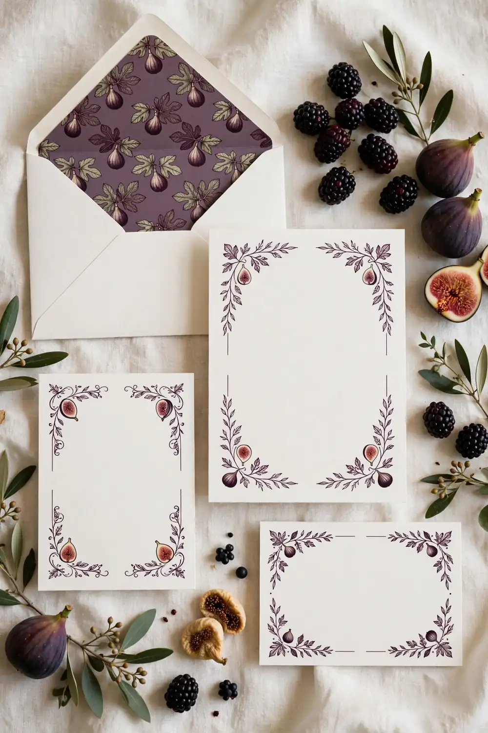
A suite printed in deep plum ink on ivory cotton paper: invitation, details card, and RSVP, with envelope liners in a fig pattern. Letterpress gives the ink a pressed-in texture you can feel. Order samples before you commit. Plum ink can print almost black on screen but reads much warmer on paper. Styling tip: use plum ink for the names and headings only, with warm gray for the body text. All-plum text is hard to read in low light.
Plum and Olive Color Story
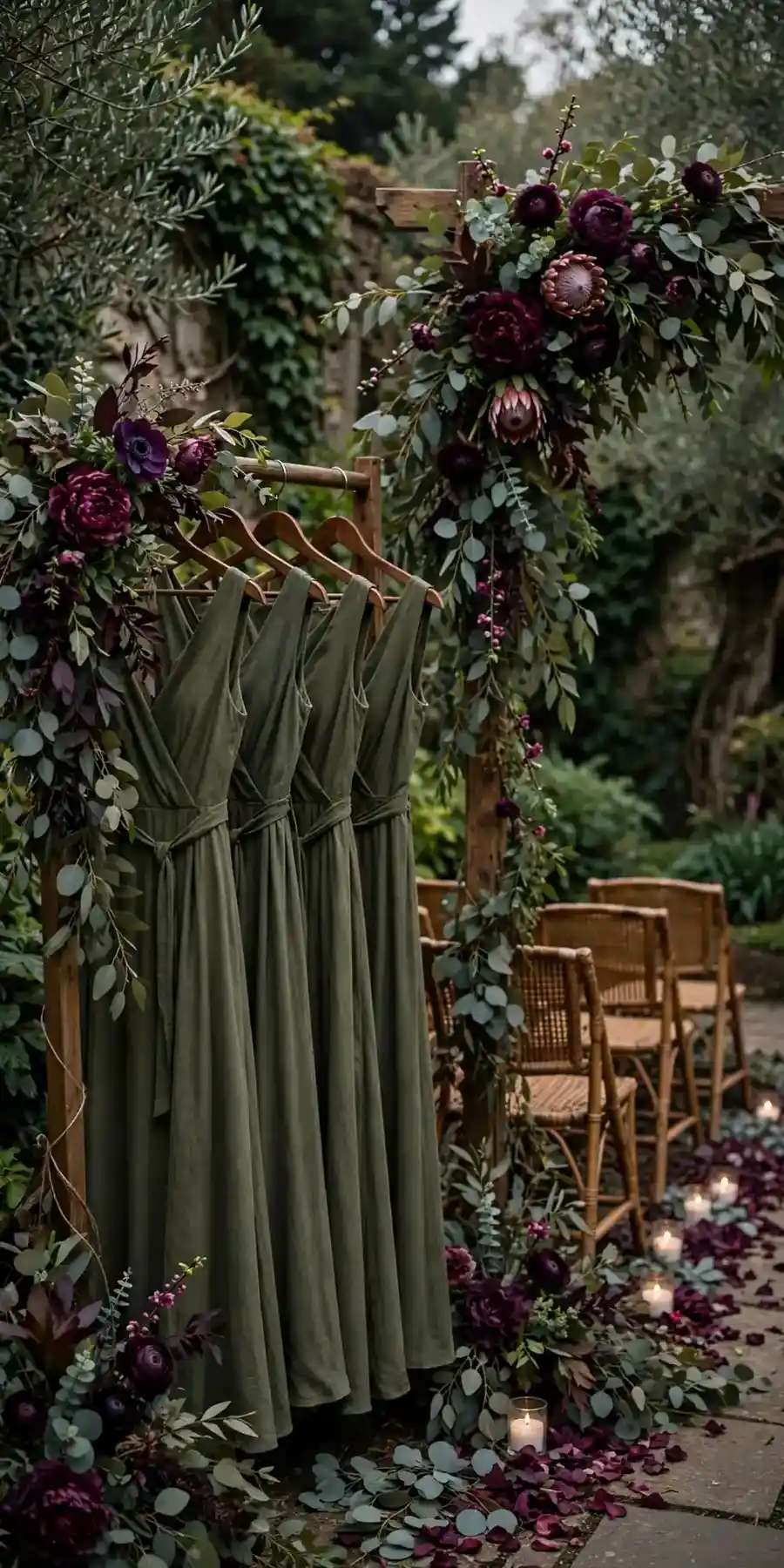
The combination driving that 1,380 percent search spike: deep plum florals and linens against olive green bridesmaid dresses and dusty olive foliage like eucalyptus. The green keeps the plum from going gothic, and the pairing looks straight out of a Renaissance painting. Use olive as the secondary color (about one-third of the palette) so plum stays the star. Styling tip: put the olive in the bridesmaid dresses and the plum in the flowers. That split photographs better than the reverse.
Blackberry Boutonnieres
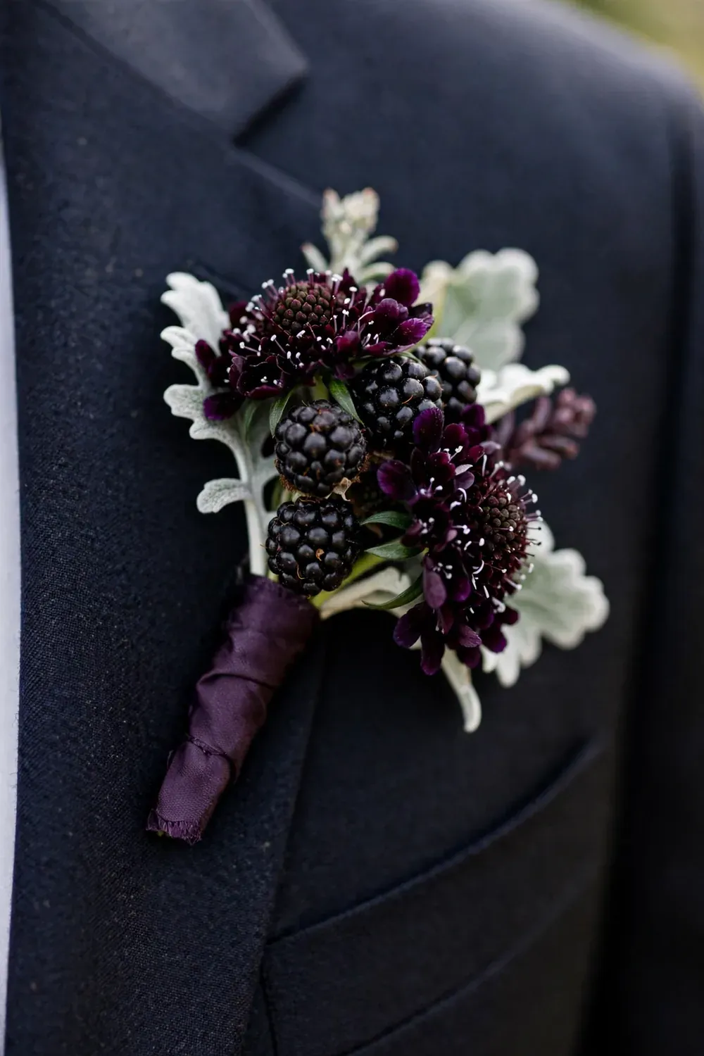
Groom and groomsmen wear boutonnieres of blackberries, dark scabiosa, and a sprig of dusty miller instead of the usual white rose. The dark berries tie the menswear to the plum palette without a single flower matching the bridesmaids. Wire each blackberry cluster so it does not fall apart during hugs. Styling tip: wrap the stems in deep plum ribbon rather than the usual twine. The ribbon is a small detail that shows up in close-up photos.
Plum Velvet Table Runners
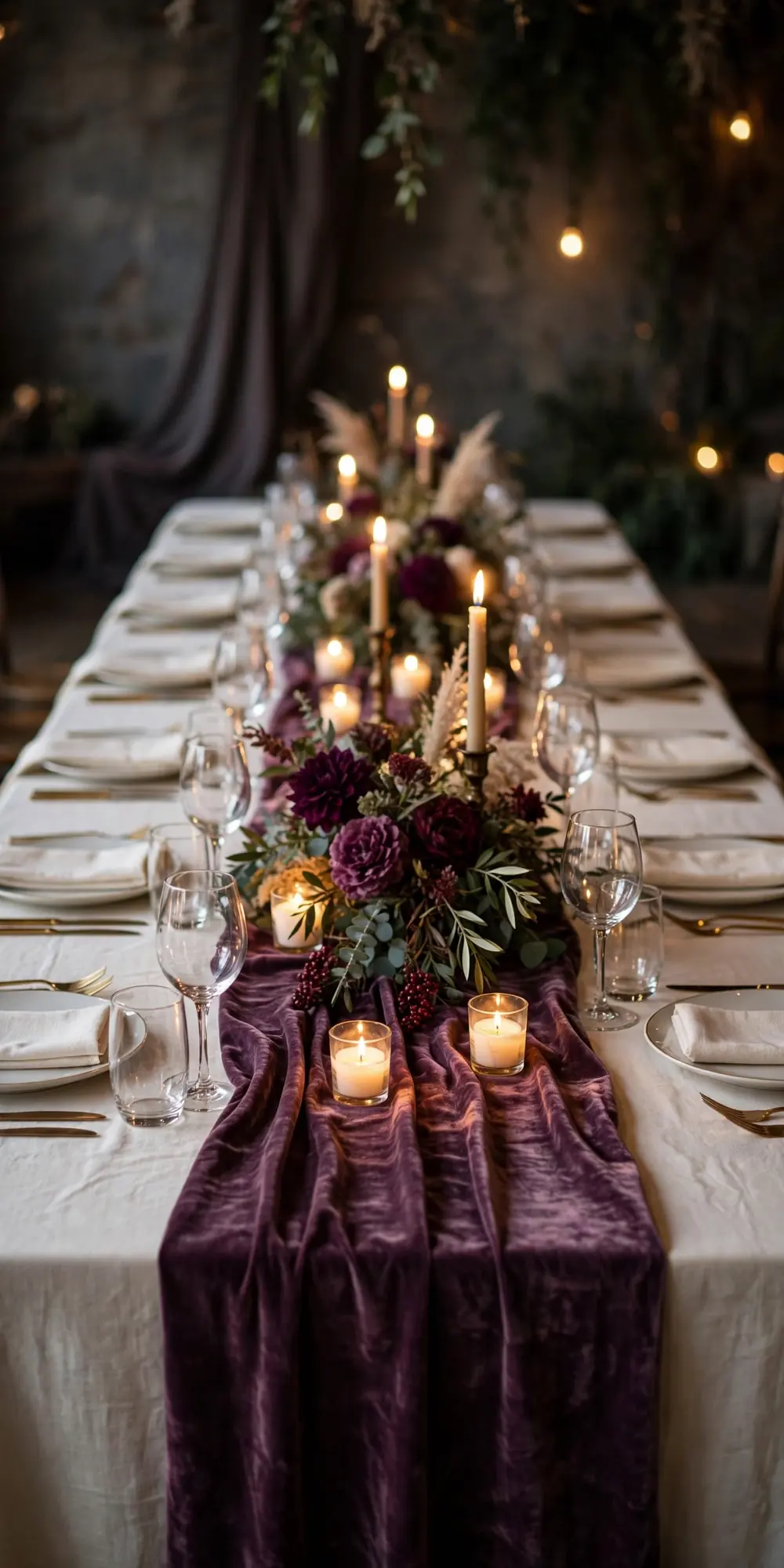
Runners of plum cotton velvet laid over ivory or champagne tablecloths, running the full length of long banquet tables. The velvet texture catches candlelight and makes the whole table glow. Cotton velvet is the right choice. Polyester velvet looks shiny and cheap under flash photography. Styling tip: let the runner hang about 8 inches past each table end. The overhang looks generous, while a runner that stops at the edge looks short.
Blackberry Bramble Signature Cocktail
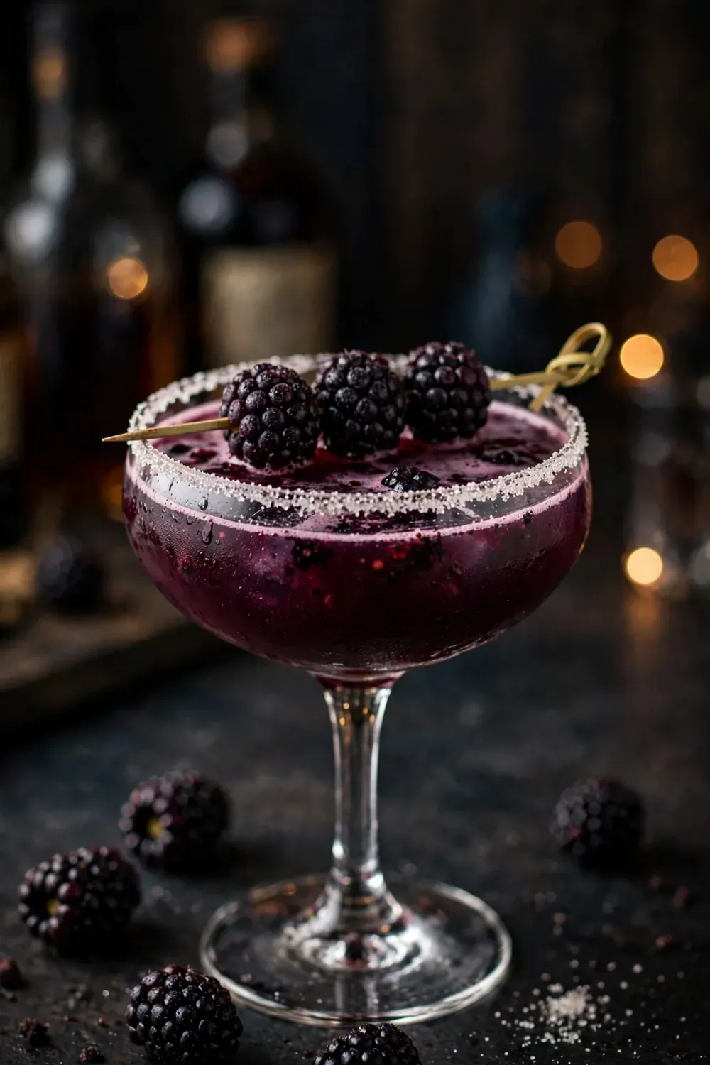
A signature drink of gin or vodka, blackberry syrup, lemon juice, and a splash of soda, garnished with three fresh blackberries on a pick. The drink is deep purple and matches the palette exactly. Batch the base (everything but the soda) in advance so the bar can pour fast. One signature cocktail plus beer and wine is plenty. Styling tip: serve it in a coupe glass with a sugared rim. The coupe photographs better than a rocks glass and the sugar rim catches the light.
Watercolor Plum Wedding Cake
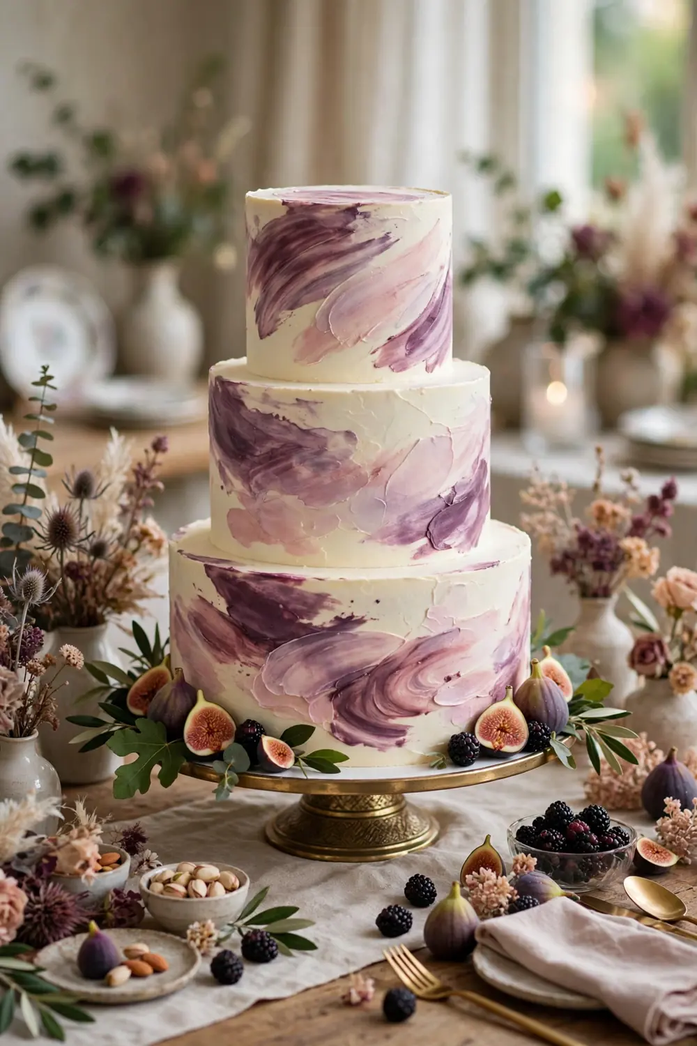
A three-tier cake with watercolor-style brushstrokes in plum, mauve, and blush over ivory buttercream, finished with a few fresh figs and blackberries at the base. The painted effect is softer than fondant and suits the artistic side of this palette. Ask your baker to see a photo of a watercolor cake they have actually made. The technique is harder than it looks. Styling tip: keep the top tier mostly ivory with just a wash of color. A fully dark cake can look heavy in photos.
Hanging Plum Floral Installation
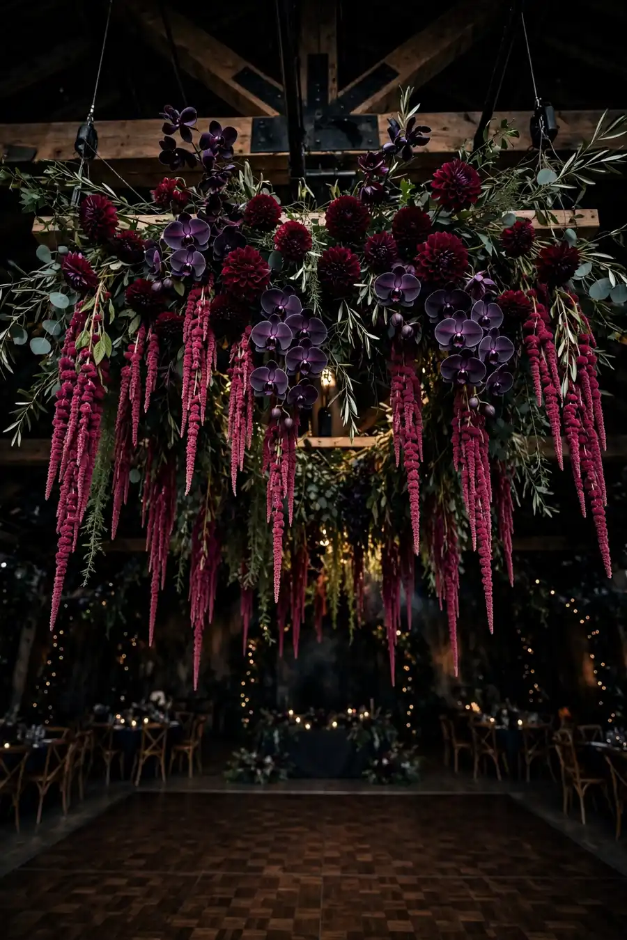
An overhead installation of trailing plum amaranthus, dark orchids, and burgundy dahlias suspended above the dance floor or the head table. Looking up should feel like standing under a plum-colored sky. This needs a rigging point, so confirm ceiling access with your venue early. Installations are priced by size, so decide the footprint before you ask for quotes. Styling tip: hang the installation at least 8 feet high. Lower than that and tall guests will brush it all night.
Plum and Gold Stationery Details
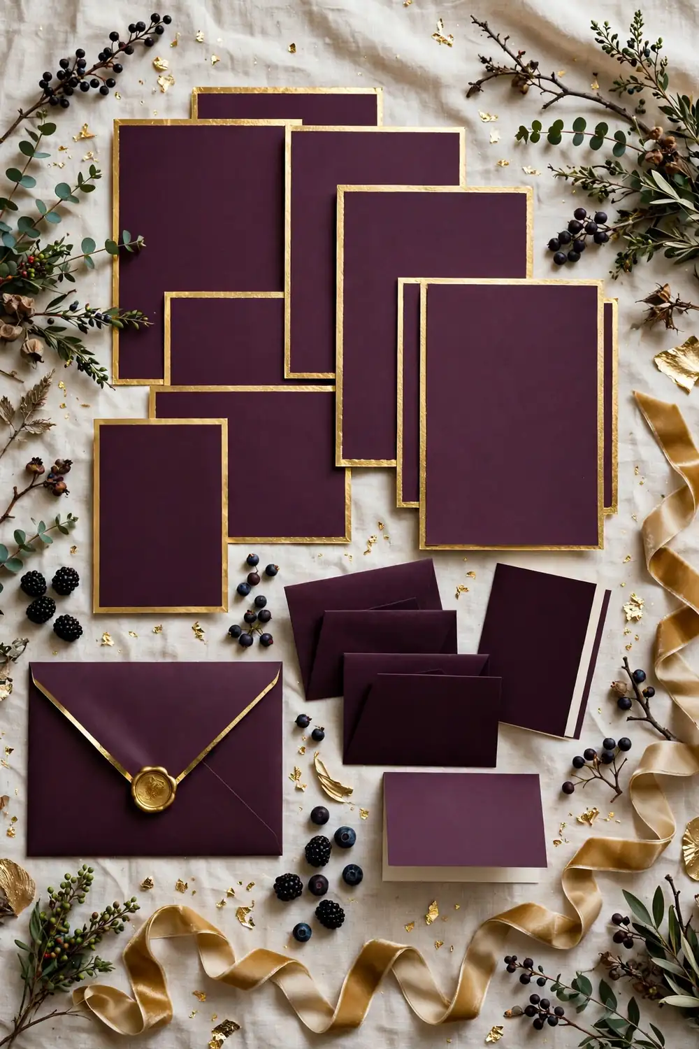
Day-of paper in plum and gold: menu cards with plum headings and gold edges, place cards in plum ink on ivory, and a seating chart with a plum background and gold lettering. The gold keeps the plum feeling celebratory rather than somber. Use a metallic gold ink or gold foil rather than yellow-gold printing. The real metallic finish is what makes it look expensive. Styling tip: carry the exact plum shade from your invitations into the day-of paper. Matching shades across paper goods is what makes a wedding look designed.
Start with the palette and let it guide every choice, from the bridesmaid dresses to the cocktail. When every detail speaks the same color language, the wedding feels designed instead of decorated.
